Hey everyone.
I just recently did a quick project for a guy who wanted to visually represent data along three dimensions. All I can say is thank goodness for Andy Pope and his charting wizardry!
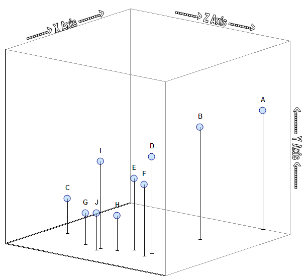
By using Andy's "3d XY-Scatter" as a starting point, doing some clever formatting, and adding in some vertical error bars, I think I've accomplished a pretty decent looking 3D "push pin" sort of representation. I even used a little known trick to add transparency to the "heads" of the "pushpins", so that when they're close together, you can still distinguish them. Here's what it looks like:
(Click the image to open up a new tab/window with a larger version.)
Now, it'd be nice to add in the ability for the graph to automatically "resize itself" -- i.e. change the values that create the reference "cage", axes, and actual minimum and maximum X and Y axes values -- based upon the data to be plotted and the rotation of each of the axes. Maybe I'll work on it if someone else wants that. Just too many projects going on at once these days.
Insiders Subscribers, your file is on its way!
Later,
Excel_Geek
Tuesday, August 21, 2007
3D XY Scatter Plot Graph
Subscribe to:
Post Comments (Atom)


2 comments:
http://www.mordwinzew.de/?p=40
there you can find a different implementation of andy popes plotter. look for (Download).
The sheet is in english
Very helpful. Thanks so much for the link to Andy Pope's website!
Post a Comment