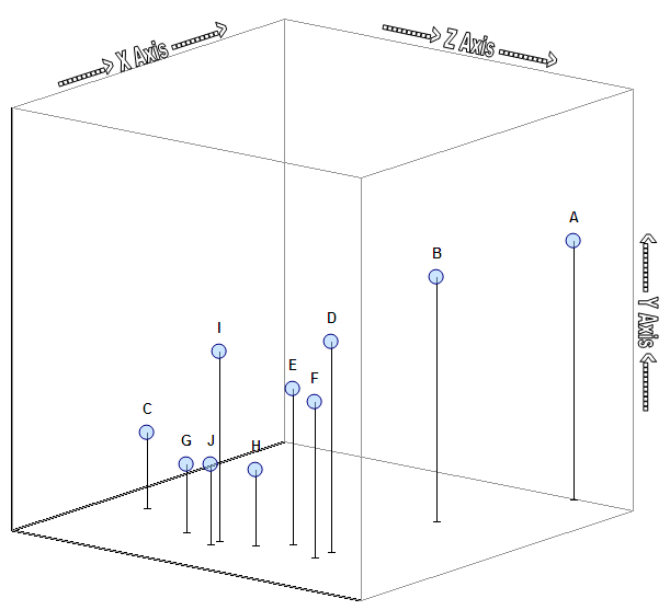
Ever wondered how a 3D chart can come in handy? I want to give an example where a 3D chart can turn a tedious task into a simple procedure. It can be very useful for a quick analysis of a data set with a glimpse of an eye.
I used to work in a call center where the shift managers had to schedule shifts for their team agents every couple of weeks. The main guideline was to conduct a periodical rotation of shifts between the agents. The shift mangers used to look on the summarized count of shifts per agent and get a big headache. For roughly 20 agents, most humans I know would get a headache... Well, I came up with a remedy in the form of aligning all that data in a 3D chart. There were only 3 types of shifts and I set the axis the following way:
- X - Agent names
- Y - Count of shifts
- Z - Shift types
 If you click to on the above image to enlarge it, you will see two inputs at the top for the selection of the Start date and the End date. These are actually drop-down menus which determine the range of dates that would be shown in the chart. The data which is feeding the chart is based on SUMPRODUCT functions which sum up the shifts per each agent for any given date range. This is also known as SUMPRODUCT with multiple conditions.
By inspecting the chart, the shift managers could immediately conclude for instance, which agents had a majority of night shifts and prioritize these agents to do other shifts in the upcoming schedule.
Eric will dispatch the file which features the 3D bar chart and the functionality behind it to the Insiders Subscribers.