This is what I love most about the Internet: collaboration with complete strangers.
A couple days ago I got an email from one of my readers, Jonathan Sickinger. Jonathan said that he searched on Google for bowl spreadsheets and found the one I did. (BTW, I saw that I'm the number one hit for a great variety of college bowl pool spreadsheet-related queries...wow!) Jonathan said that after playing around with the spreadsheet for a few days he decided to make some edits and customizations. Great! He made some cosmetic changes to match an entry form that he sends out to his pool participants. I like the look better than what I had done, personally. Next he added space for up to 40 participants (over my 35).
Then Jonathan said that he had an epiphany: In addition to the individual tracking charts, wouldn't it be great if we also had a chart for each bowl? These charts allow participants to see the pick dispersion for each game, giving them a sense of how important that game is to their overall chances. For example, if everyone in the pool weights the same game as one of their most confident picks then the relative importance of that game drops significantly. Follow? Jonathan also threw in some data on each game to show where the bowl ranks in average points wagered and the distribution of who picked which team. Very cool.
I thought it'd be nice to share with everyone this new and improved version and it's accompanying entry form, so here you go:
0809_College_Bowl_Pool_worksheet_Sickinger_mod.xls
0809_College_Bowl_Pool_Sickinger_entry_form.xls
Note: the file's a bit heftier now at >2,500 KB vs. the roughly 1,200 KB it was before, but I think the new features are worth the added weight.
Next up? Jonathan and I are thinking about collaborating on a VBA-based enhancement to make it so that once a pool organizer gets everyone's entry forms back, he or she can simply click a button to pull everyone's picks into the master workbook. That'll be sweet, no?
Later,
Excel_Geek
Sunday, December 14, 2008
Reader's Enhancement to 2008-2009 College Football Bowl Spreadsheet

Monday, December 08, 2008
2008-2009 College Football Bowl Spreadsheet
Remember that college football bowl pool spreadsheet I did last year (and the year before )?
Well...I guess it's now a holiday season tradition. Here's the same one updated for this season's match-ups. My gift to you.
0809_College_Bowl_Pool_worksheet.xls
This year's has been updated so that you can track up to 35 participants, and I've reformatted the individual charts sheet, so that it prints out nicely.
Merry Christmas,
Excel_Geek
Thursday, December 13, 2007
2007-2008 College Football Bowl Spreadsheet
Hey, anyone remember that college football bowl pool spreadsheet I did last year?
Well...Merry Christmas! Here's the same one updated for this season's match-ups. My gift to you.
0708_College_Bowl_Pool_worksheet.xls
Speaking of Christmas gifts, be sure to check out the Excel_Geek line of merchandise I've got up on Cafe Press. This guy's got one...man does he look cool.
Later,
Excel_Geek

Wednesday, December 20, 2006
The Excel_Geek's Super College Bowl Game Pool Sheet
Yesterday a buddy of mine requested a project. He's a college football (pro football, any football, any sports, really) nut, and so he's involved in setting up a bowl game pool. What he wanted was a simple spreadsheet to keep track of everyone's picks, as well as how many points they allocated to those picks. Then as the games are played and winners are known, the sheet could be updated to see how the points standings are going.
He said he looked all over the internet, and there are tons of them out there, but everyone wants too much for them.
Being in the Christmas spirit, I decided to bang one out for him at a $50 discount. That's right...free.
The sheet is fairly straightforward. I've used sheet protection and data validation to ensure users don't "break" the sheet, and I'm using a bunch of conditional formatting to show which games are over, which picks were good ones, etc.
I also included a chart summarizing the current standings at any given point.
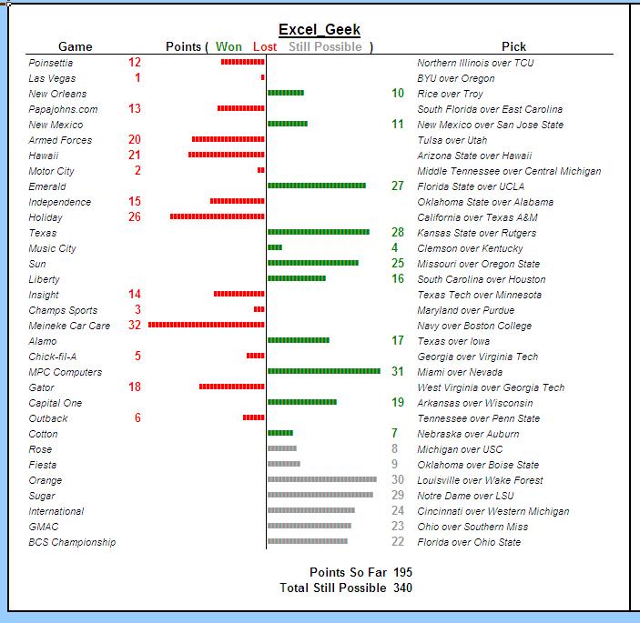
The real bonus (to me)is another sheet in the workbook which contains an in-cell tornado chart of each participant's ongoing results. The visual depiction helps you easily understand which picks gave you the most points versus those which did the most damage. Here's an image of those charts:
Merry Christmas, Jason, and merry Christmas to all of you Insiders subscribers who are getting this one, too!
Tuesday, September 26, 2006
In-cell Charting - Tornado Chart Example
I'm sure that most of you, being Excel geeks like me, have heard about the technique to create so-called "in-cell" charts in Excel. The guys over at Juicy Analytics recently had a couple of posts on this subject that garnered a great deal of attention from fellow bloggers, with some people going as far as saying that this technique is superior to the built in feature to be included in Excel 12. I'll hold judgment there until I've personally had more time with Excel 12, but for right now, this in-cell charting technique is certainly a quick, easy, light-weight (to steal a term from the JA guys) means to do some fairly powerful data visualizations.
I thought I'd post a demonstration of how using this technique, one can create in-cell "tornado charts" -- a type of chart commonly used to visually depict various data points for two different groups. John Peltier's site shows a nice example of using Excel charts to create tornado charts, which I in no way want to diminish, but here's a simple example of using in-cell charting to do it, too.
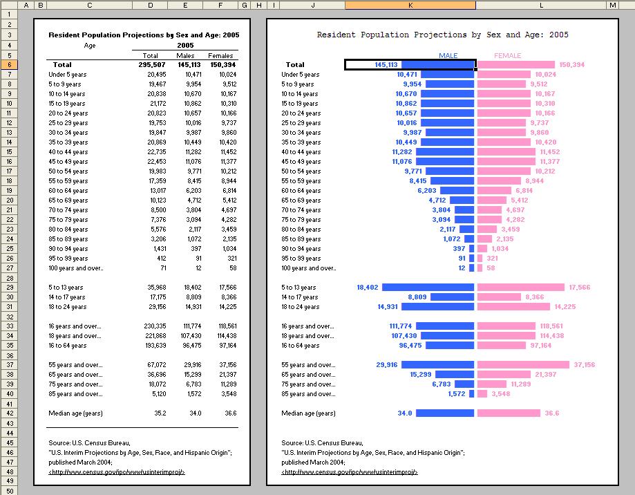
A relatively common place to see tornado charts is for census data for men versus women, so I grabbed some quick data from the Statistical Abstract of the United States of America (one of my favorite sources of data) to get me started. Below is a small image of what I created:
(Click the image to view a larger version of the chart.)
See how much more visually appealing data can be in this style of chart?
The formula used in the top, "MALE" column looks like this:
=FIXED(E6,0,FALSE)&" "&REPT("█",ROUNDUP(E6/10000,0))
The special, rectangular character is ASCII code 219. It seems simple and I'm actually a bit embarrassed about it, but it was only recently that I learned that one can use ASCII codes directly in formulas (and in most applications, actually) by simply holding down the ALT key and typing the numeric code. Huh. █ I just did it again. Simple. Anyway, this code provides a nice solid bar.
The cell E6 contains the value I'm visually representing with the bar. Note that I use the FIXED function to display the whole numbers with the commas -- followed by a couple of spaces, then I repeat the ASCII code 219 to make the bar in the chart. Note that I divide the value by 10,000 so that the bar is not too long, then I roundup that value to the nearest whole number. What rounding up in this manner prevents is a situation where, say, the data is 219, and I'm dividing it by 10,000, which if simply rounded to the nearest whole number would result in zero, and therefore show no bar at all, despite there being data greater than zero. Rounding up provides at least one character in the bar to represent relatively small data points.
In the bars immediately following, I divide by only 1,000. Later on, I divide by 2,000, and on the last one, I divide by only 3. Each group is obviously showing a different scale, but it looks nice this way, and still maintains the visual comparison between the MALE and FEMALE data points.
By right-aligning the cells in the MALE column, they line up along the center line. I then repeat a very similar formula in the FEMALE column:
=REPT("█",ROUNDUP(F6/10000,0))&" "&FIXED(F6,0,FALSE)
Note that in this formula the bar comes before the value it represents (since it's on the right), and I align these cells to the left. BLUE vs. PINK color-coding for MALE vs. FEMALE is typical (at least in the United States), so I thought that was a nice touch.
This example is a fairly large chart, but one of the really nice applications for in-cell charting is dashboard reporting, where many times you're trying to squeeze eight or ten or sixteen individual charts into a one page document. In-cell charts can fit that bill very nicely.
I'm very curious to learn if any of you have done cool things with this in-cell charting technique, so please pass along any thoughts or examples -- via commenting on this post, emailing me, or by using my Meebo Me chat feature (Like how it now scrolls up and down with you?). I'll be sending out this example file to my Excel_Geek Insiders subscribers for their enjoyment, as well.
Until later,
Excel_Geek