I'm sure that most of you, being Excel geeks like me, have heard about the technique to create so-called "in-cell" charts in Excel. The guys over at Juicy Analytics recently had a couple of posts on this subject that garnered a great deal of attention from fellow bloggers, with some people going as far as saying that this technique is superior to the built in feature to be included in Excel 12. I'll hold judgment there until I've personally had more time with Excel 12, but for right now, this in-cell charting technique is certainly a quick, easy, light-weight (to steal a term from the JA guys) means to do some fairly powerful data visualizations.
I thought I'd post a demonstration of how using this technique, one can create in-cell "tornado charts" -- a type of chart commonly used to visually depict various data points for two different groups. John Peltier's site shows a nice example of using Excel charts to create tornado charts, which I in no way want to diminish, but here's a simple example of using in-cell charting to do it, too.
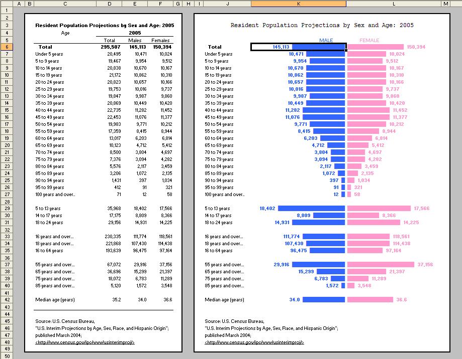
A relatively common place to see tornado charts is for census data for men versus women, so I grabbed some quick data from the Statistical Abstract of the United States of America (one of my favorite sources of data) to get me started. Below is a small image of what I created:
(Click the image to view a larger version of the chart.)
See how much more visually appealing data can be in this style of chart?
The formula used in the top, "MALE" column looks like this:
=FIXED(E6,0,FALSE)&" "&REPT("█",ROUNDUP(E6/10000,0))
The special, rectangular character is ASCII code 219. It seems simple and I'm actually a bit embarrassed about it, but it was only recently that I learned that one can use ASCII codes directly in formulas (and in most applications, actually) by simply holding down the ALT key and typing the numeric code. Huh. █ I just did it again. Simple. Anyway, this code provides a nice solid bar.
The cell E6 contains the value I'm visually representing with the bar. Note that I use the FIXED function to display the whole numbers with the commas -- followed by a couple of spaces, then I repeat the ASCII code 219 to make the bar in the chart. Note that I divide the value by 10,000 so that the bar is not too long, then I roundup that value to the nearest whole number. What rounding up in this manner prevents is a situation where, say, the data is 219, and I'm dividing it by 10,000, which if simply rounded to the nearest whole number would result in zero, and therefore show no bar at all, despite there being data greater than zero. Rounding up provides at least one character in the bar to represent relatively small data points.
In the bars immediately following, I divide by only 1,000. Later on, I divide by 2,000, and on the last one, I divide by only 3. Each group is obviously showing a different scale, but it looks nice this way, and still maintains the visual comparison between the MALE and FEMALE data points.
By right-aligning the cells in the MALE column, they line up along the center line. I then repeat a very similar formula in the FEMALE column:
=REPT("█",ROUNDUP(F6/10000,0))&" "&FIXED(F6,0,FALSE)
Note that in this formula the bar comes before the value it represents (since it's on the right), and I align these cells to the left. BLUE vs. PINK color-coding for MALE vs. FEMALE is typical (at least in the United States), so I thought that was a nice touch.
This example is a fairly large chart, but one of the really nice applications for in-cell charting is dashboard reporting, where many times you're trying to squeeze eight or ten or sixteen individual charts into a one page document. In-cell charts can fit that bill very nicely.
I'm very curious to learn if any of you have done cool things with this in-cell charting technique, so please pass along any thoughts or examples -- via commenting on this post, emailing me, or by using my Meebo Me chat feature (Like how it now scrolls up and down with you?). I'll be sending out this example file to my Excel_Geek Insiders subscribers for their enjoyment, as well.
Until later,
Excel_Geek
Tuesday, September 26, 2006
In-cell Charting - Tornado Chart Example
Subscribe to:
Post Comments (Atom)


4 comments:
that's pretty cool. it would be interesting to layer on % of the total in there as well
What's with the stupid Chat With The Geek window that stays in front of the content you're trying to read? If you must have it, float it over one of the side columns.
Which browser are you using? For Firefox and IE 6, the chat window is hovering over the right side bar. Let me know which browser you're using, and I'll try to get this working properly in it, as well.
Excel_Geek
Nice tornado chart. A potential improvement, to double the "resolution" you can achieve with in-cell charts is to use the technique I describe at http://jcandkimmita.info/jc/2007/07/business/tools-methodologies/yet-another-in-cell-excel-bar-chart-technique/
Post a Comment