Recently I was contacted by a technical trader who uses eSignal to scan for and execute stock trades. He had a problem for me to solve, but first I'll need to give some explanation as to what he's doing, though I must admit, he was rightfully secretive about many of the details:
Basically, each morning he uses Yahoo Finance's Stock Screener (an effective and free tool) to identify a group of stocks to watch that day, based upon a certain set of technical factors that he's developed over time (this is one secret part). He actually does this four times, each with a different set of factors. When he's done, he's got four lists of stock tickers, each of which might typically contain 20 to 50 line items, which he can export to a CSV file and open in Excel. Then what he does is create an advanced chart in eSignal for each ticker in each of the four lists, each list having a unique chart configuration and associated with unique and proprietary formulas or "studies" that he's created over time (here's the other secret part) that automatically execute trades on a stock when certain conditions are met.
The problem is that most of the really "good" trade opportunities happen very early in the morning after the opening bell. Meanwhile, he's manually creating charts for 80 to 200 tickers, which takes an hour or so, so he's missed the bulk of the good trade opportunities.
"Excel_Geek, can you help me automate the creation of these charts quickly so I don't miss all the good trades?" Sure.
So what I'd need to do is run down a list of ticker symbols in a spreadsheet, and then create a new chart using the right configuration (of the four he uses) in a whole other software program -- eSignal -- for that ticker. Huh...how do I do that?
So I got online with the technical support people for eSignal and asked some dumb questions. "Is there a way to automate the opening of a large number of advanced charts programmatically?"
"No."
Hmmmm. Now I started reaching, "How about using Shell commands? Can I do it with Shell commands?"
"No."
Really? "'No' like 'you shouldn't do that' or 'no' like 'that is not possible'?"
"It is not possible."
Really? I needed to know who I was dealing with, "Do you have a programming background?"
"No."
That's it then. I'm going to figure out how to do it, and it turns out, that it can be done, and I did it.
What I built is a spreadsheet where this trader can copy-paste in his lists of tickers, click a button, eSignal is fired up, and all of the charts are opened. Instead of an hour or so, it takes about 15-20 seconds. Not bad. He'll get those good trades now!
On the drawback side, we learned that eSignal is a bit resource-hungry, particularly when using advanced charts. With an AMD Athlon 64x2 Dual core processor 4600, 986 MHz, and 2 GB of RAM it starts to choke on around 150-160 charts open at once. Perhaps with some additional RAM and tweaking the paging file settings, we can get some better performance, but in the end, 150 simultaneous opportunities to find profitable trades is not too shabby.
I must disclose to you all that this was a Private Project rather than a $50 Project, so I won't be sharing it with all of my loyal Insiders subscribers. Sorry. However, my client was more than happy to let me generally write about the project here, and he's even expressed interest is licensing it to others if they're interested.
Interested? Shoot me a line.
Later,
Excel_Geek
Thursday, April 12, 2007
Automation Work for eSignal Stock Trading Software User

Sunday, March 11, 2007
Get your March Madness Bracket Here
Ever since my post describing the NCAA basketball bracket spreadsheet I created, I've been getting asked, "Are you going to post that file so that we can use it?"
Sure.
I even filled in the teams picked today ("Selection Sunday") and you can download it all for the bargain basement price of $3.00. Just click here to send payment via PayPal (major credit cards accepted), and you'll be taken to the download page (Zipped file). OR...if you'd rather, you can download the file here, then email for the key code once you've sent $3.00 PayPal to ehunzeker@gmail.com.
Some of you might be wondering why I'm rolling out a $3.00 NCAA basketball bracket spreadsheet. Why not just give it away for free?
Well, here's a little secret: what I really wanted to show off to you -- many of you being Excel geeks in your own right -- is a terribly handy little piece of programming I've been working on: a super simple, self-contained means for locking down standard Excel spreadsheets for licensing purposes.
When you download and open the NCAA basketball bracket file, you'll be prompted to email me a "License Lock Code" that is generated when you open the file (be sure to enable macros). I'll then send you a corresponding "License Key Code" which will open up the file for your use. Oh, and if you think you can pay once and share it with your friends -- it's just a spreadsheet after all...should just be able to copy it and share it with whomever you like, right? -- not so fast. When your friends open the file on their computers, they'll auto-generate a different lock code, and will be prompted to get their own unique key code (and pay, too). How about that?
So...for all of you March Madness crazies, enjoy the download for less than the price you might pay for a decent cup of coffee, and for all of you Excel programmers who've been looking for a way to protect the brilliant spreadsheets you've created over the years, drop me a line if you'd like to learn how I created this little security system. I'm currently working on commercializing it, too.
Later,
Excel_Geek
Monday, February 26, 2007
UPC Barcode Generator
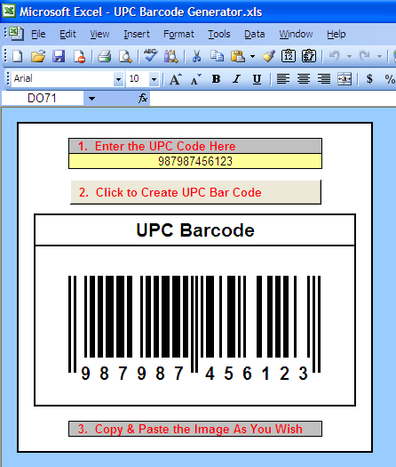
Here's a recent $50 Project I completed for a client: a simple, straightforward UPC barcode image generator. Now, many of you might be groaning, thinking, "Come on, Excel_Geek, there are hundreds of barcode add-ins and software packages out there that work with Excel." And you're right. What's wrong with them? Nothing really. This client simply wanted his own ultra-simple Excel-based solution -- something he could input a number into and get an image he could use.
Here's a look at what I built:
(Click on the image above to open it larger in another window.)
How's it work? Basically I created a range containing cells with very narrow column widths and used conditional formatting to change the background color of the cells to either black or white, depending upon the value in the cells (either "TRUE" or "FALSE") which I obtained using VLOOKUP formulas to grab the appropriate value for each digit in the code from a table containing them.
Then once the "live" version of the barcode is set, I use Excel's little known "camera" feature (copy a range then hold down shift when selecting the Edit menu and you'll find it -- this feature is gone in Excel 12 :-( ) to copy the range containing the barcode and paste it as a copy-pastable image.
It was remarkably simple once I understood how UPC barcodes work.
To my Excel_Geek Insiders (who'll be receiving this file soon as part of your subscription), unhide the hidden rows if you really want to to see the "guts" of how this works.
Later,
Excel_Geek
Thursday, February 08, 2007
Comparing Phrases - Google Adwords Application
I just completed a $50 Project for a client who wished to compare a list of phrases to see if they appeared in another list, only the thing was it didn't matter what order the words in the phrases were.
So...if the phrase "big boy eats cake" was in the second list, "boy eats big cake" would result in a match. What is important is that both phrases contain exactly the same words...no more no less, but the order is irrelevant. I believe the application for this type of function was to make sure that a list of keyword phrases, say for a Google Adwords campaign, didn't contain any phrases that would be "duplicates" for that purpose.
Using formulas to parse out the individual words in the phrases and a little bit of VBA code, I think I've come up with a simple-ish solution to this little problem.
Later,
Excel_Geek
Sunday, February 04, 2007
Okay...Who's Ready for a New NCAA Basketball March Madness Bracket?
I can't tell you how many requests I get, from close friends and family, as well as from readers around the United States and internationally, for an Excel-based NCAA men's basketball March Madness tournament bracket. Well, here's a pretty neat one I whipped up just in time for the tournament.
The workbook consists of three sheets:
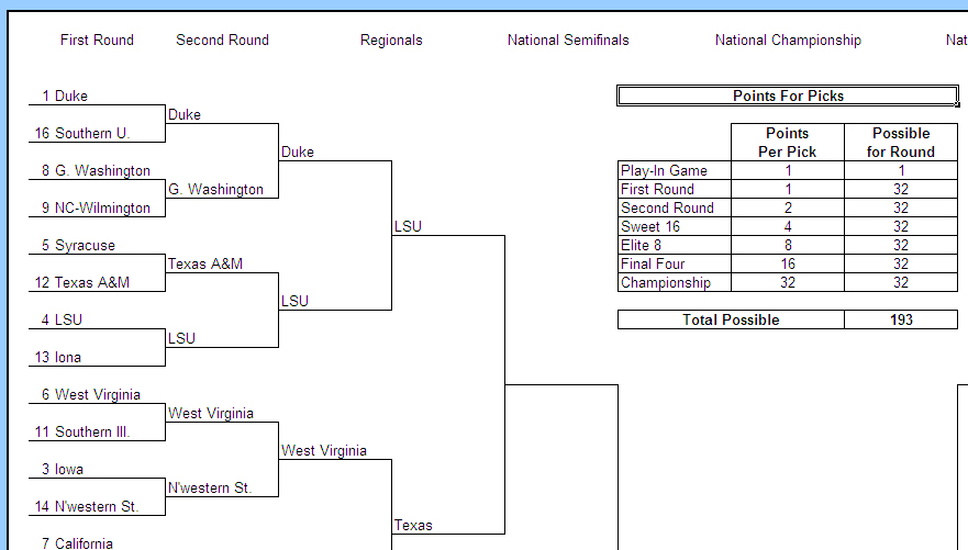
1) The "Setup & Actual Results Bracket" worksheet is where you input the teams who've made the tournament, record the results of the games as they are played, and also where you can set how many points each correct pick is worth by round. The image below is a glimpse of this worksheet (well, at least the upper left quarter of it). Don't worry, this is laid out so that you can nicely print the entire bracket on one 8.5" x 11" page.
(click on the image to open it up larger in a new tab/window.)
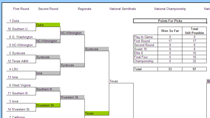
2) The "My Picks & Points Bracket" worksheet is where you would predict the winners of each game. Using data validation, I've managed to automatically make each cell into which you make a pick only allow the teams playing in that game. Then, using conditional formatting, I've made it so that correct picks (once you've input the actual results in the other worksheet) show up as green, and incorrect picks show up as grey, AND eliminated teams that you've picked to win subsequent games will also show up grey. Finally, this sheet contains an up-to-date total of the points you've won, as well as the total possible points still remaining based upon your picks.
(click on the image to open it up larger in a new tab/window.)
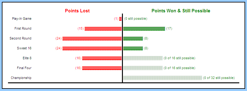
3) The "My Points Chart" worksheet contains an in-cell tornado chart (I admit it: I've got a thing for these crazy charts!) displaying round-by-round performance.
(click on the image to open it up larger in a new tab/window.)
Now, the way I've set up this file, it's pretty much self-contained for a single person to track their picks and points, but I can certainly envision using this as the basis for a complete system in which one "master file" is created to track the results of the actual games as the are played and to set the number of points awarded for correct picks in each round. Then any number of "player files" are created and emailed to each person to make their picks and email back to the person managing the system. Then the "master file" could simply reference the results in each "player file", displaying a summary or a leaderboard, if you will. Could be pretty cool.
To my growing Excel_Geek Insiders subscribers, enjoy this file...it's on it's way. To those of you who haven't subscribed yet, did you know that for only $39.95 per year, you get copies of all Excel_Geek $50 Projects I do for the year, as well as copies of these special little projects I just decide to do? It's true. Sign up today!
Enjoy the tournament!
Excel_Geek
UPDATE: I released this file for download. See comments here. Download the file here.
Tuesday, January 30, 2007
Did you notice? www.excelgeek.com!
Anyone notice that as of yesterday, I'm now blogging on my own, shiny, new domain: excelgeek.com! I'd like to thank Rick for being so generous and cooperative in transferring this domain to me, and I'd like to let you all know that I plan to test out my new-found-but-still-lousy web design skills to create a "real website". I'll be keeping the blog, too, but I have some plans for other stuff. That's why I'm redirecting from www.excelgeek.com to blog.excelgeek.com for the blog currently.
Well, I'd better get busy on that new website...
Later,
Excel_Geek
Monday, January 22, 2007
Heat Charts, Another Creative In-Cell Charting Technique
I recently completed a $50 Project for a client who wanted to create visual "heat charts" from data in a matrix. What's a "heat chart" you ask? Well, basically, it's a color-coded representation of the relative data values contained in a data set. What?
Ok, so say you've got four columns of data in four rows: The columns represent the four seasons of the year, and the rows represent four different cities around the world. The data in the matrix might be the average midday temperature in each of those cities over each of the four seasons. A heat chart would represent this data showing the hottest (highest) value as bright red, and the coldest (lowest) value as deep blue, and everything in between would fall on that spectrum from red to orange to yellow to green to blue. Now, obviously, a heat chart can be used to represent any data, not just temperatures...
Here's a picture so you can see what the heck I mean:
(Click on the image to open it up larger in a new window.)
How's it work? Well, basically I just use some formulas to convert the values in the matrix into an "index" from 0 to 100, where 0 is the lowest value in the chart (or another user-specified minimum value) and 100 is the highest value in the chart (or another user-specified maximum value), and all other values in the chart fall somewhere, proportionately, in between.
Using the values in this "index" version of the chart, (using VLOOKUP) I reference each the RED, GREEN, and BLUE values for the RGB color representing that index value from a predefined COLOR SPECTRUM table.
Then, with a macro in the ThisWorkbook object, I automatically set the background color (using the RGB property in VBA -- i.e. "cel.Interior.Color = RGB(RED_VALUE, GREEN_VALUE, BLUE_VALUE") every time the sheet is changed.
This together with some general cell formatting, data validation, and some other macros to help automate adding and subtracting rows or columns, and there you have it.
Pretty cool if you ask me.
Later,
Excel_Geek


